Tag Archives: larry gomez art

History of My Batcat Art

I’ve been attending science fiction conventions for nearly 40 years. Sci Fi conventions offer a variety of activities for anyone interested in the genre. There are panels on various related topics, dealer rooms, author and artist meetups and signings, costume contest, and an art show. One of my favorite things to do there, is attend the art show. I have sometimes exhibited, and sold, some of my own work there. You’ll see a variety of subjects, skill levels and styles of art, by amateurs and professionals. Dragons, elves, spaceships, mermaids, and all manner of science fiction, fantasy and horror from books, comics, movies and tv shows, as well as from folklore from around the world are found there.

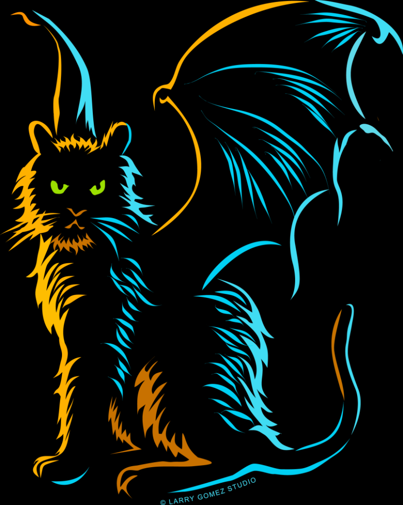
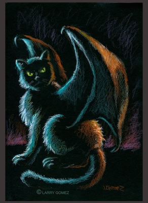
One of the things I noticed often at various convention art shows were the cute, cuddly kittens and cats with feathered wings. They were done in a variety of color and sizes, and often pictured with cute dragons. They were popular and great if you like that sort of thing, but not something that appealed to me. I wanted to create something in response to that, something that resonated with me more. Black cats have always been my favorite cat, so I already knew that this new work they would be involved. They’re a little more menacing and indifferent. And of course, bat wings. So, in 2016, I decided to tackle that idea.

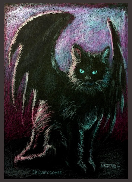
I tend to hang onto paper, cardboard, canvas or any scrap surface, for use in future projects. I found some excess black mat board from graphic design classes years ago and decided to draw on this in color pencil. The boards are small, around 5×7 inches. I’m a fan of the blacklight posters from the 60s and 70s, as well as black velvet paintings popular then. I did a couple of pieces with these materials several years ago, and remembered how much I enjoyed working with it. Like those, I knew these works would use that black as the majority of the image, drawing the highlights.

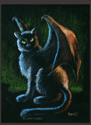
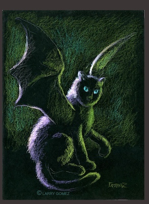
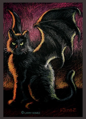
I researched cat and bat images, then sketched up some ideas. Once I had made a few, I went ahead and finalized one piece. I think I just started drawing the first piece without prepping the black surface with a sketch. I don’t usually work that way, but went with it for this piece. It has the unimaginative title of “Batcat 1”. Happy with this result, I created a few more, on other small sizes of black mat board, and titled subsequent pieces accordingly.

The World Science Fiction Convention, AKA WorldCon, is held in a different part of the world every year, and in 2018, it was held in San Jose, California. I bought a space in the art show and brought along some of the batcat original pieces, along with other art and prints. At that point, I’d sold a couple already, so didn’t have those. All the batcats originals sold at that show, and I sold a few other originals, as well.

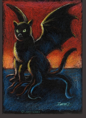
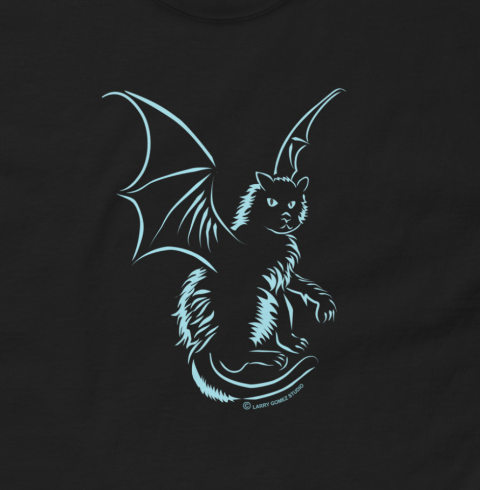
A few years ago, I started turning some of the batcat images into designs for t-shirts. This required me to create images in a more graphic style that would translate better for use in merchandise, as shown in the two images below. Eventually, I incorporated those into other merchandise, such as stickers, cards, etc. These images encouraged me to do more art in that style, which is something I had not really focused on until then.

Mano Derecha Roja or the Red Right Hand, Comes to Town

I’ve been a fan of Nick Cave and the Bad Seeds since I heard Red Right Hand in the mid 90s, and this is still one of my favorite songs by them. It always evoked a sinister, dark feeling, because of Cave’s voice, but also the narrative itself. Who is the “tall, handsome man, in a dusty black coat, with the Red Right Hand”?

More people are now aware of the song, since part of it is used in the BBC drama, Peaky Blinders. So now, many people that I know associate it with that show. Here’s my art inspired by the Red Right Hand, that I call Mano Derecha Roja. Below, I describe the process that brought this image about.

Mano Derecha Roja. Red Right Hand. man in cowboy hat and coat.
Mano Derecha Roja.

I don’t remember what reminded me of the song when I drew this. I just started drawing, and came up with this pretty quickly on this 8×8 inch sketchbook. I modeled this somewhat after myself, in that I gave the figure a mustache like mine, and a hat and coat similar to some I own.

Pencil sketch with railroad and trestle.
Photoshop flat shape.

Here, I did a rough layout in Photoshop just to get a feel for the pose I wanted. I put the money in the figure’s right hand, since the hand looked like it was holding up something.

I eliminated the railroad image and put a viaduct in the background, as well as indication of mills with smoke from the stacks. All of those, are elements from the lyrics. I thought the mist curling in front would some atmosphere to the piece.

This stage reminded me a bit of Daniel Brereton’s work. He creates mostly horror-themed art, but also does some comics work. I like the stark, dramatic, but still very colorful, ligthing he tends to use in his artwork. I think I was channeling a little bit of that at this stage in this picture.

I noticed the right had was a bit off, that it was turned at a wrong angle, as if the had is perpendicular to the arm. I moved it so that it seemed like it actually was attached to the arm and holding the money naturally.

When I first created this layout, I drew the long coat as I thought it might look, not from anything I’d seen at that point, just my idea of one. It was good enough as a placeholder, but wanted it to look like something that could exist. I found some references of coats that looked more like I pictured it, sort of based on a trenchcoat I own. The collar is different than in the earlier images, the lapel more obvious. I also changed the mist from a pale blue to pale green.

The right hand at a more natural angle.
New style of black coat.

In the next image, I gave the red hand more definition and pushed the contrast a bit more. The shirt has some color, indicating it is dark purple, like one I have. Also, I added a belt buckle design from one that I have. The coat is also more defined.

Final version, so far. I deliberately left the background kind of vague, and expressive. I darkened the storm clouds and subdued the purple, so it’s more of a suggestion than a major color. The red right hand is clearer, and I pushed the contrast on the entire image. At this point, it’s pretty much finished, though I have worked on it a little since this stage, and there are some places I might still tinker with.

Mostly done. Just a few more touches.
Mano Derecha Roja. Red Right Hand. man in cowboy hat and coat.
Mano Derecha Roja. Final version.

What Do You Call A 12 Foot Tall Flightless New Zealand Bird Grazing In Your Yard?

I like puns, palindromes, similes and all sorts of other wordplay. I’m also interested in extinct animals, like the dodo, passenger pigeon or the aepyornis. So, this image covers both ideas.

I usually attend World Con, the World Science Fiction Convention, for those that don’t know what that is. This year it was scheduled to be in Wellington, New Zealand this summer, but because of the pandemic going on, it became a visual convention, only available online. I often show my artwork there and at other conventions. Here is a link to more info about it: ConZealand. I happened to have some images featuring this New Zealand bird. I’ll post those at a later date.

What I did here is, printed the pencilled drawing onto a sheet of matte photo paper, which I sometimes use to draw on. I then colored the image with black and color inks, to get an idea of what to use, mostly just to play around with colors. I’d seen paintings of moa where the feathers were green or some other color. But from what I’ve read, based on DNA of feather samples, the moa had brown feathers. Below, you’ll find more images showing the process leading up to this.

Like many of my artworks, this started out as a simple sketch, after I’d gotten the phrase into my head. I didn’t spend a lot of time brainstorming for a layout or anything, I just saw something like this image in my mind, so I sketched it out in a sketch pad page.

I then proceeded to transfer that to another sheet of drawing paper to refine the linework a little bit. I took some time looking at this layout. I inked this with a regular writing pen, to get some crisp lines. I took a photograph with my phone and uploaded it to my computer for layout ideas in Photoshop. I didn’t need a really crisp image, since I was going to play around with it digitally. I decided I liked it better flipped horizontally, with the bird on the left, as in the second image.

The moa in the picture was just standing in the yard like a lawn ornament. I got the idea of having it eating the grass, emphasizing the mowing aspect. I came up with this image on a separate paper. It was the first image that I drew and was happy with the way it turned out. I traced it and the background of the previous incarnation, and drew it in pencil. I photographed it and uploaded it to the computer. Then, I added it to the background from before and drew this in pencil. This is what I used for the color version above.

Below is another version that I created in Photoshop with its native brushes. I changed the pitch of the garage part of the house. It seemed a little to steep. I looked at my old house in Mesa, Arizona, on Google maps to better portray the look of this style of house. I’m not sure what else I’m going to do with this. I may do a finish digitally, or print out another sheet and color it with color pencil, watercolor, and/or ink. And there you have: The Lawn Moa.